The following points should be paid attention to when designing packaging boxes: first, the relationship between color and packaging materials; The second is the contrast between color and color itself. These two points are the key points in the use of color.
Color and packaging
So, as the reference relationship between color and packaging, where should we start? Mainly through the external packaging color can reveal or reflect the internal packaging. People can basically perceive or associate what the inner packaging is when they look at the outer packaging. We can walk into the shop to celebrate the goods. Many goods fail to reflect this kind of caring relationship. So that consumers can not think of what the packaged goods are from the outside to the inside. Of course, it will not play a positive role in promoting sales of products. The color of normal external packaging should grasp the same feature in different degrees;
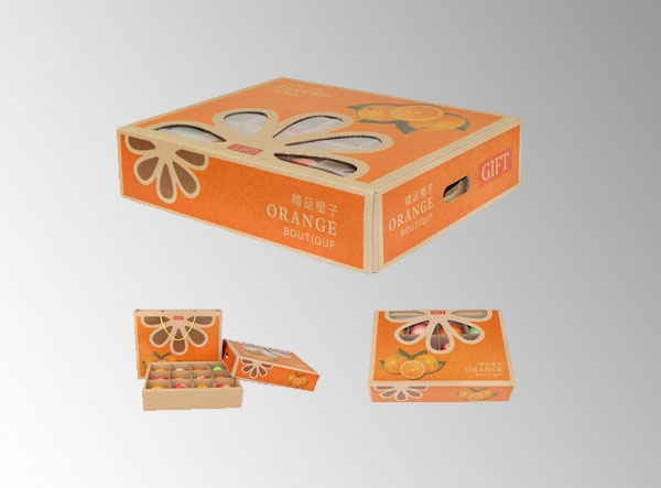
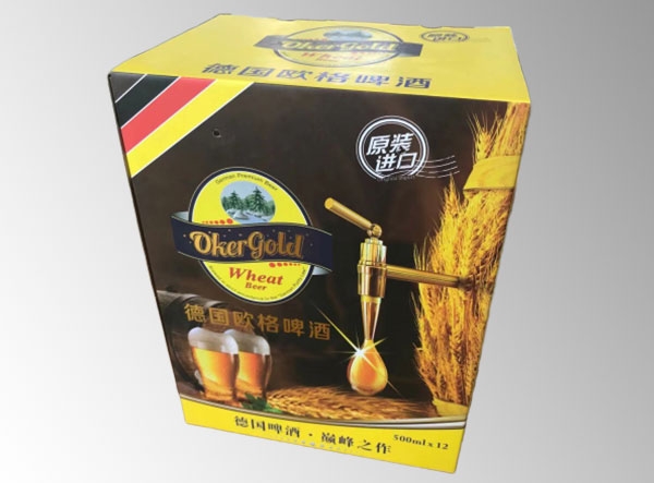
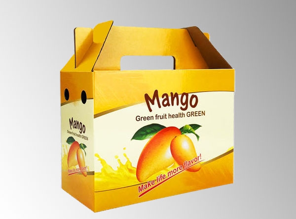
(1) From the perspective of the industry, food packaging is normally expressed in the main colors of goose yellow and pink, which gives people a warm and intimate feeling. Of course, many of them use green tea, many of them use green and blue for drinks, many of them use bright red for wines and cakes, and many of them use rose color for children's food. The main colors of normal daily cosmetics are mostly rose, pink white, light green, light blue, dark coffee, and the clothing, shoes and hats are mostly dark green, dark blue, coffee or gray.
(2) From the aspect of performance characteristics, as far as food is concerned, cakes and pastries mostly use gold and light colors to give people an impression of fragrance; Tea, beer and other drinks are mostly red or green, which symbolizes the richness and fragrance of tea; Tomato juice and apple juice are mostly red, which indicates the natural attributes of the item. Although some packages do not use the color with similar commodity properties as mentioned above from the perspective of main color, if the design of the package is written by one's own family, then there must be some symbolic color blocks, color dots, color lines or concentrated content highlighted by that color in the picture of its outer package. This should be everyone's masterpiece.
Contrast between color and color
Moreover, the contrast between color and color. This is the easiest thing to show but not easy to grasp in many commodity packages. In the design, it comes from a master. The wound effect of the packaging is just like a snow in the sun. On the contrary, it is like a beggar. There is a popular saying in Chinese calligraphy and painting, that is, close to the wind, sparse to run a horse. In fact, it is a kind of contrast relationship. This contrast is very obvious and common in packaging design. These contrasts generally have the following aspects: the contrast of depth, weight, point and plane, complex and simple, refined and popular, contrast and so on.
The contrast of colors used.
This is the most frequent and widely used color in current packaging design. The so-called contrast of depth and light should mean that the two colors of depth and light are skillfully displayed on the same screen at the same time in the design of color, thus producing a kind of perspective effect that is more harmonious. Usually, a large area of light color underlay is used, and dark color composition is used on it, such as a light color underlay, which is composed with coffee color, or light yellow or white pattern lines are used in coffee color color blocks; Also like using light green as the base; Dark green composition; Pink bedding; Big red composition; Light gray bedding; Soap black composition and so on. In China, Changyu wine, Shuanghui sausage and CJ meat products are mostly packaged in this way. Its visual effect is bright, simple, mild and elegant.